AI Concierge for Your Credit Cards
Project
Klariq
Year
2026
Klariq helps people decide which credit card to use before they pay.
The idea came from a simple problem I kept noticing: most people have multiple credit cards, but choosing the right one at the right moment still feels like guesswork. Rewards change, merchants are categorized differently, offers expire quietly, and users rarely have time to calculate which card actually gives them the best return.
I designed Klariq as a personal product concept to explore how AI can make financial decisions easier to understand, not just faster. The product compares the cards in a user’s wallet, the merchant they are buying from, active offers, and reward rules, then recommends the best card with a clear explanation.
My focus was on recommendation logic, trust, comparison, and turning missed rewards into simple next steps users can act on.
I used Claude to accelerate front end prototyping and explore interaction variations quickly. Product strategy, UX architecture, recommendation logic, interface direction, and case study decisions were defined by me.
Scope of Work
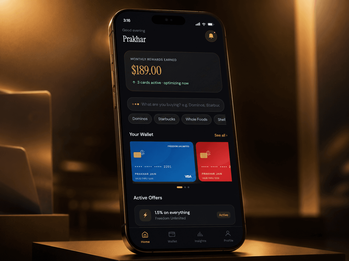
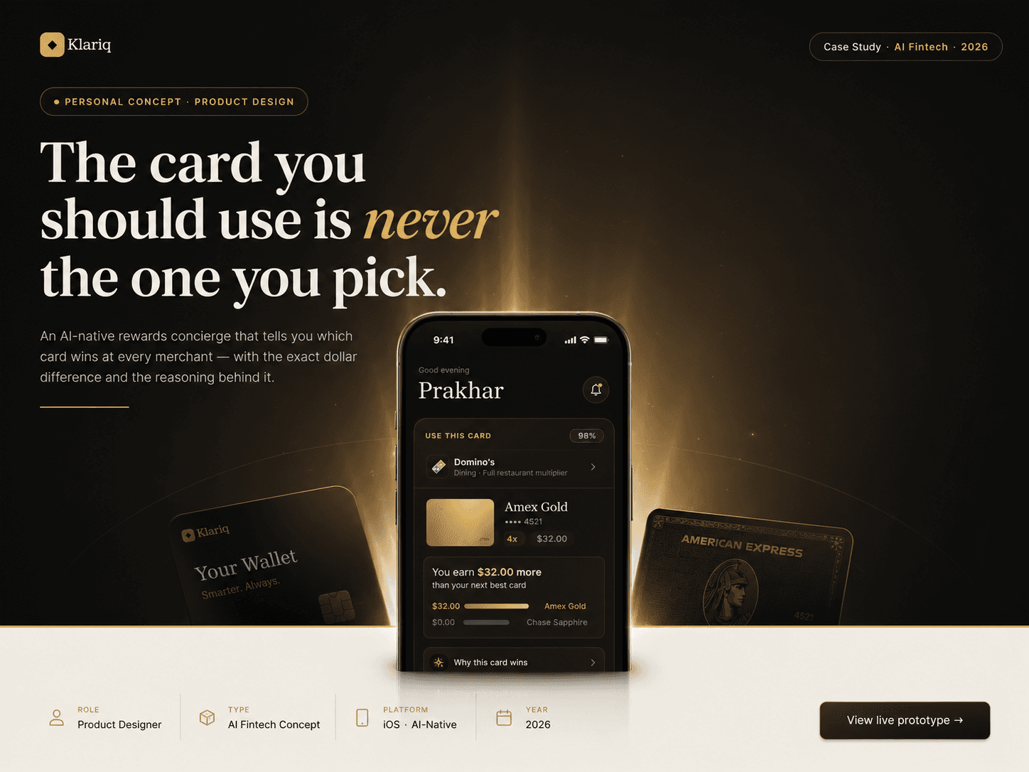
Overview
Klariq is a personal product concept I designed to solve a real decision problem: choosing the right credit card at the moment of purchase. The goal was to turn card rewards from a manual tracking task into a clear, contextual recommendation.

Problem
The issue is not that users do not care about rewards. The issue is that the rules are hard to act on in real time. Categories rotate, merchants are classified differently, credits expire quietly, and users are expected to remember too much at checkout.

Recommendation Logic
I designed the recommendation flow around one simple sequence: identify the merchant, check the user’s connected cards, apply reward rules, calculate the dollar value, rank alternatives, and explain why one card wins.

Comparison
The comparison experience avoids vague “best card” language. It shows the real dollar gap between cards so users can understand the tradeoff without needing to calculate points or multipliers themselves.

Insights
Klariq does not stop after one recommendation. The insights flow shows missed value, explains why it happened, and turns that into a next best action the user can take.

Design System
The visual system was designed to feel calm and trustworthy. Gold is used for value and action, neutrals keep the interface quiet, and feedback colors are reserved for success, alerts, and data.

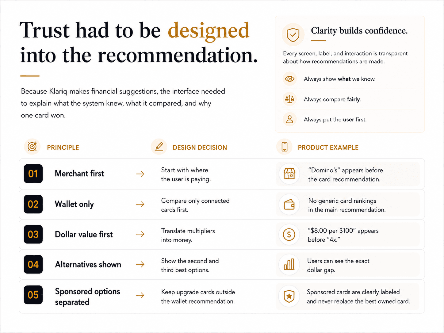
Design Principles
Reflection
This project helped me explore how AI recommendations can feel more trustworthy when the interface shows context, reasoning, comparison, and limits clearly.